oxbow ui
Astro & Tailwind CSS Templates
GitHub
System
Light
Dark
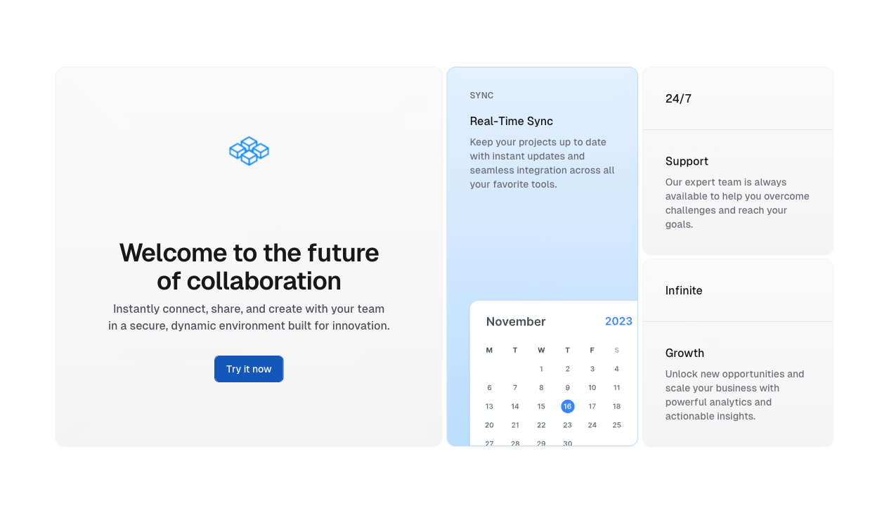
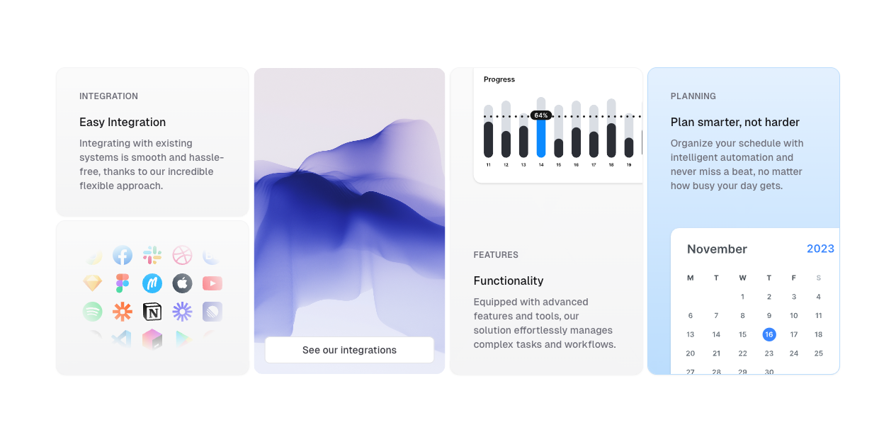
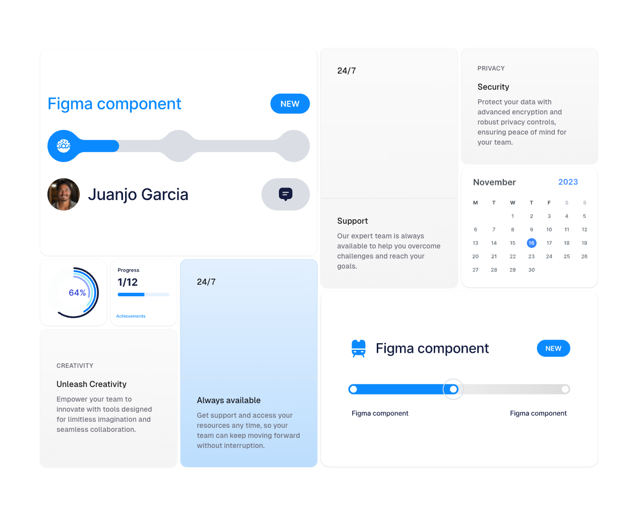
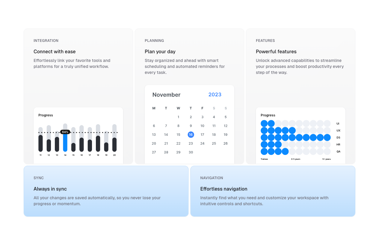
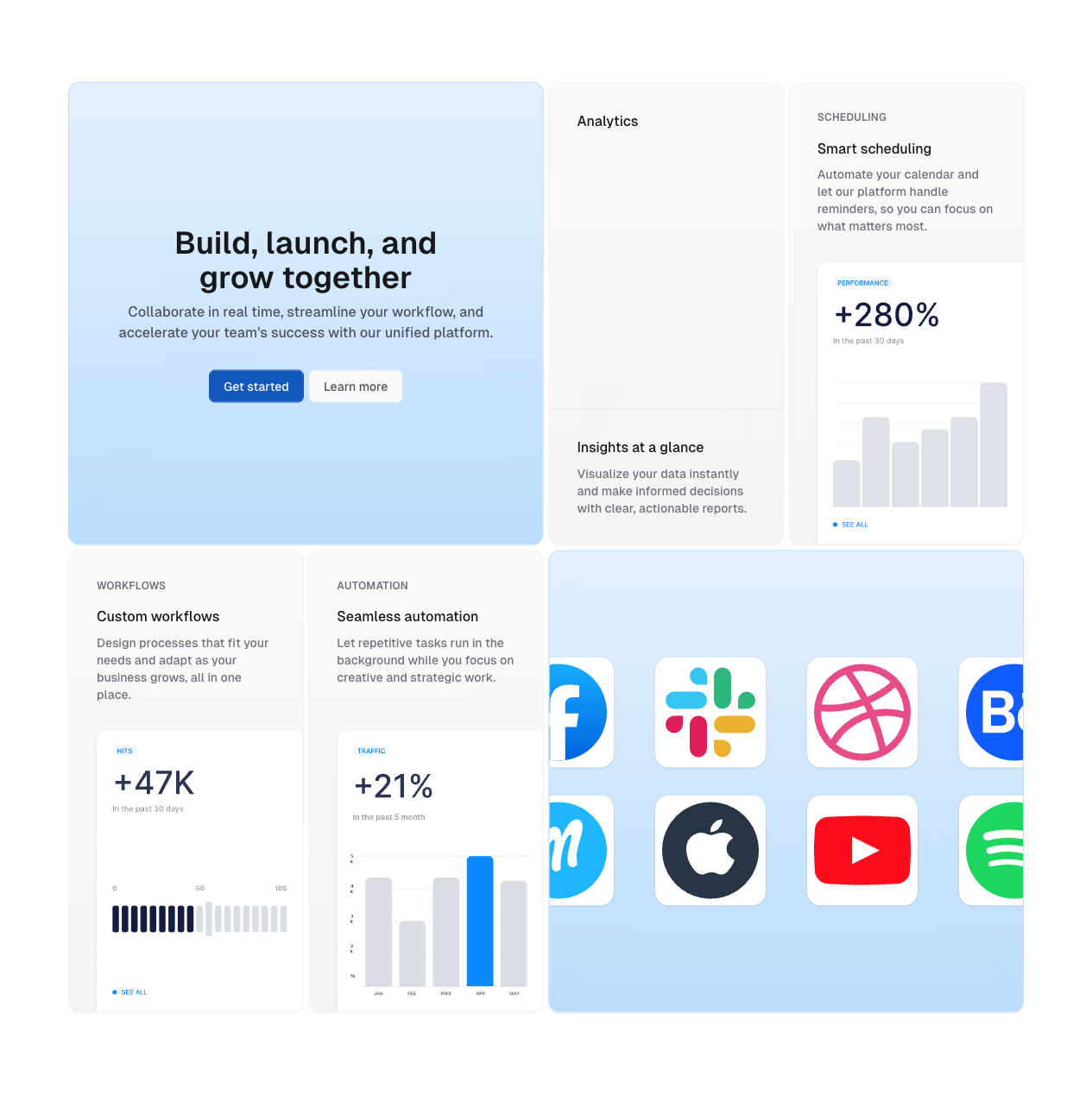
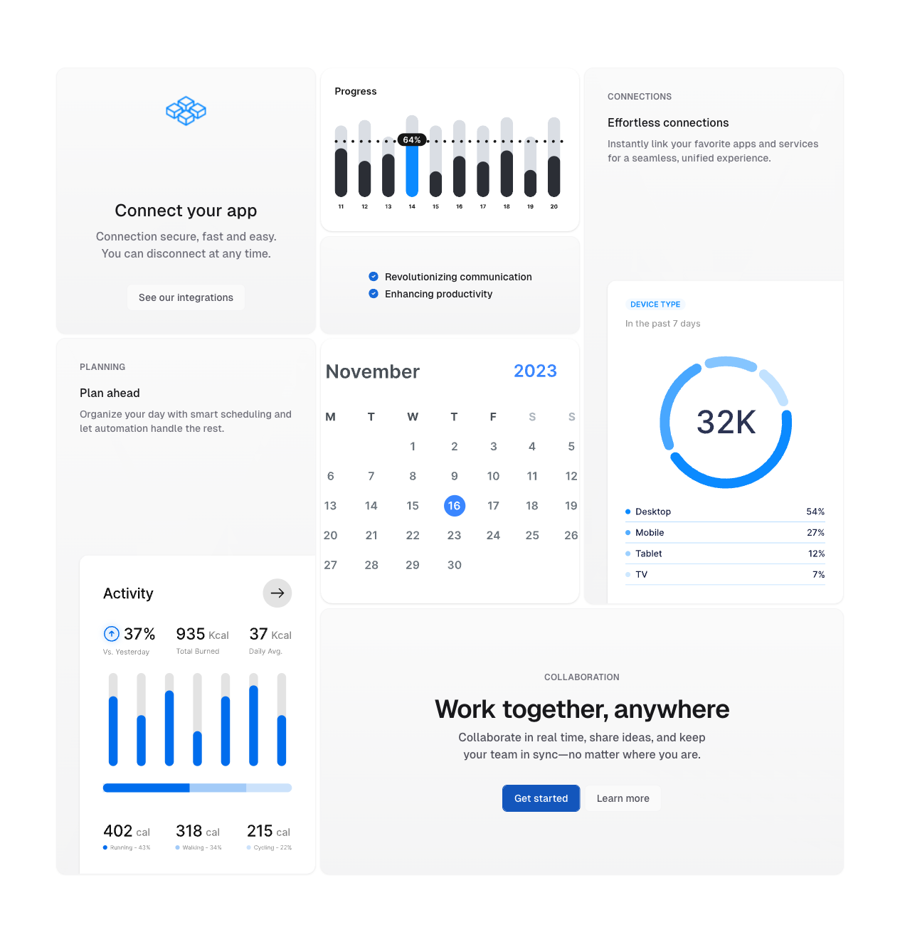
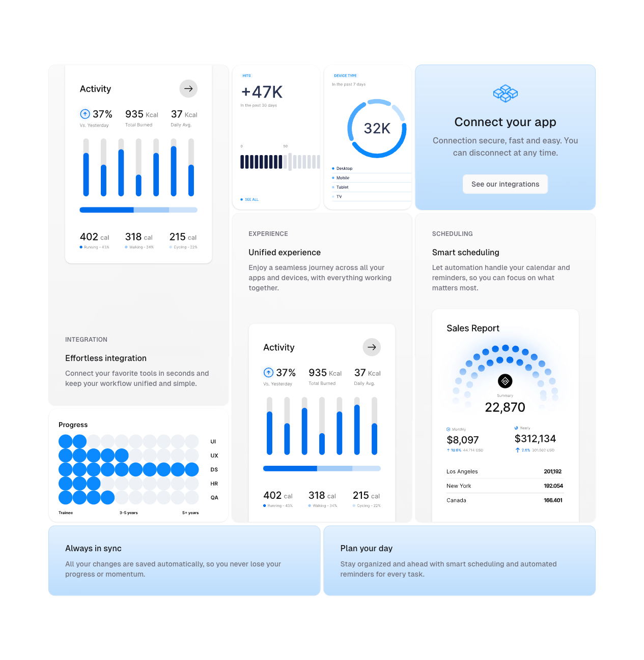
bento grids
Marketing
Bento Grids